A one stop platform where players across the world can group together and play against each other while maintaining close communication.
Spark Game Arena

THE PROBLEM
Spark Game Arena wants to launch Spark as a platform in New Zealand where players can smoothly enjoy matches regardless of its game format.
ROLE
I worked together with senior designers Midzi, Sahana and Jax in the design team.
RESPONSIBILITES
Research Wireframes User Scenarios Interface Design
PLATFORM
Desktop
Mobile


Discovering opportunities
Define
Spark is focused on fundamental tasks for users such as the flow for joining tournaments once the site is introduced to users.
There are 3 different users: TO, competitive players and casual players. Goals were also identified as shown below, to better structure the screens.
Who are our users


How might we…
Ensure a smooth experience for individuals with minimal experience in esports, while firming Spark’s stance in the Esports industry.
💡Ideation
We worked closely with the CX team to understand their requirements and discuss on the important functionalities that is needed for the different phases. Thereafter, bouncing off ideas to identify the direction of the project and seeking their feedback. We discussed and decided for the first iteration the focus to be on:
📌Team members
Join tournament for single and team formats
5 different game formats of tournaments presented to users which are : Single Elimination, Double Elimination, Ladder, Round Robin, Battle Royale and Swiss
Tournament detail page needs to be clear and concise
Competitive analysis
Thus, we started analysing the different esports platforms currently on the market, identifying strengths as well as areas of improvement. and their step by step flow especially join tournament which is a crucial step for users.

Example of ideating in Figjam


Detailed observations for Battlefy and Challengermode
I also recorded certain trends and observations in these platforms regarding what I discovered to be valuable, intriguing, or distinct which may be useful for future iterations. These trends revolved around aspects such as match making and also customisation of avatars.
✅ Key takeaways : We realise that most of the platforms view invite friends, in-game ID as an important part during the user flow, allowing us to better prioritise the important UI while creating our own flow.

Style guide

Spark’s colour palette was created with the client’s branding given to us from the CX team. We adapted the atomic design system format to structure our components. By investing time on structuring the design system, it allowed us to focus more of our time on larger complex UX issues. The style guide also serve creates a unified language across stakeholders like developers and QA team for implementation and bug reporting.


Wireframing + first iteration

To gather additional insights on the usability statistics for our new user interface and to ensure optimal usability, we employed Maze for unmoderated user testing. This involved creating prototypes of the 'join tournament' flow, conducting pilot testing , and obtaining heatmap data to further iterate upon.
Qualitative User Research
Uncovering user insights
In order to find out more about the usability statistics for our new UI and ensure good usability, we invited 5 testers using Maze for unmoderated user testing on whelther the join tournament flow fits in with the user behaviour and capture the usability score.

Screenshot of the study testers will receive - Pilot Testing Mode

Heatmap example showing users spending most of the clicks on removing a team member

Insights from the study:
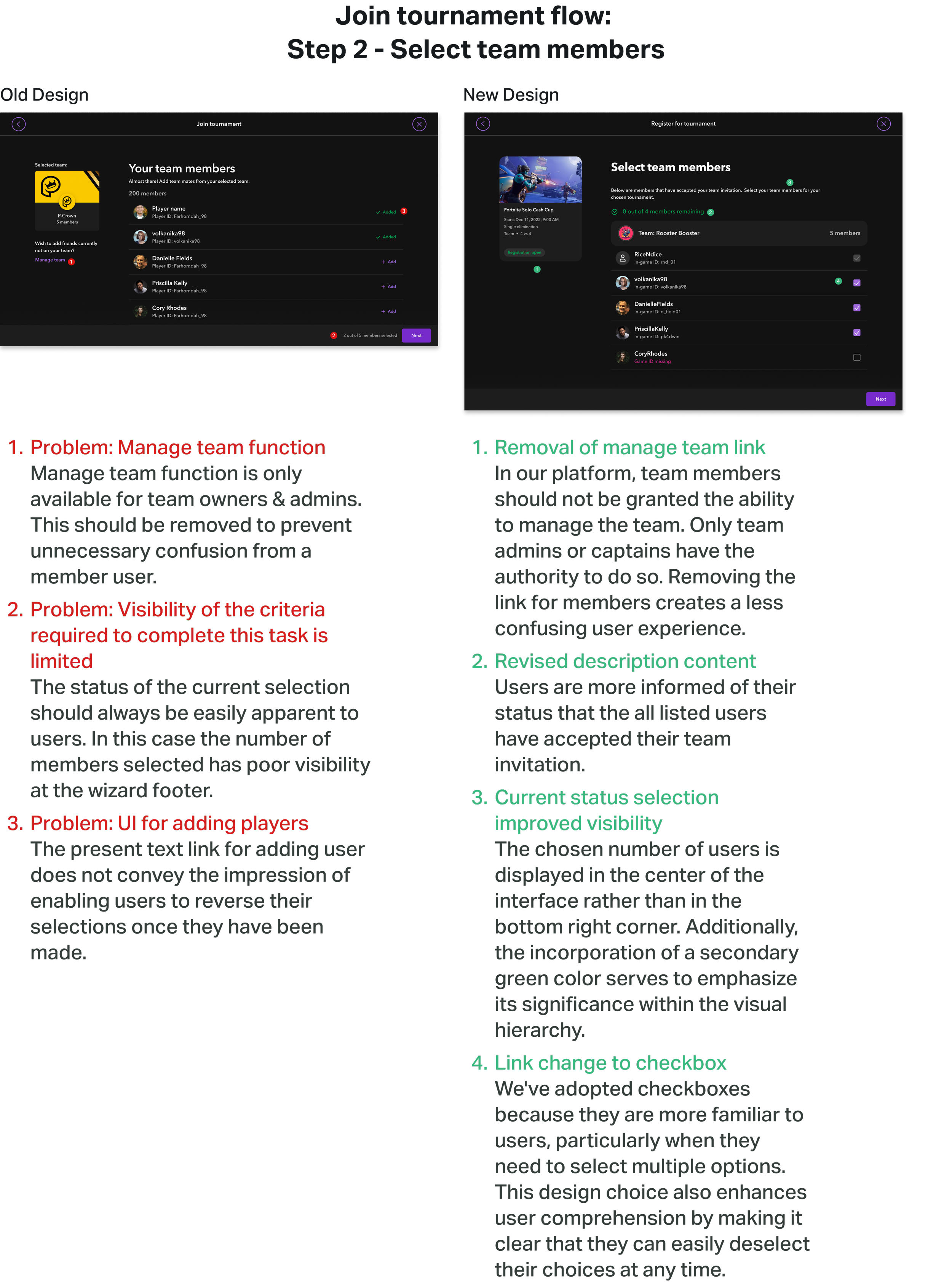
Walkthrough of main changes


Hi-Fi designs

Liaising with developers
Jira was used to raise tickets to ensure consistency between design and environments. Tickets are categorised into problem types 1,2 and 3 to determine priority level. This allowed us to communicate directly with developers about the ideal designs.

Updates in progress
Currently, Spark is on beta environment to allow for testing on Spark’s side. We're delighted with how the app has turned out and got some great feedback from them on how to improve. We're continuing to work on promoting the app and making improvements based on user feedback.
If given more time, I would delicate it to:
Identifying the time on task & completion rate of the matchmaking process
Better adhere to WCAG standards
Work on milestone goals as part of onboarding module

