Arizona
Tackling high workplace accidents issue among construction workers

THE PROBLEM
There is a high number of workplace accidents for migrant workers
THE SOLUTION
A dashboard which allows their supervisors to obtain real-time updates on their workers especially during emergencies through watch and mobile app.
ROLE
UX/UI Designer
RESPONSIBILITES
Research
Sketches
Wireframes
Interface Design
PLATFORM
Web/E-commerce

Recognising existing problems
Being a new designer at Vulcan-AI, I looked at the products and learnt in product & stakeholder meetings that the supervisors had a lot of areas that needed clarity on the dashboard and that the dashboard’s information architecture was not set up well resulting in fragmented experience.
Dashboard was not intuitive enough, causing huge amount of time to be spent learning how to use it.
New features to be implemented for dashboard and launch of watch product.
As part of the project, we needed to reassess the dashboard's information architecture and incorporate new features. This, in turn, impacted the type of data to be displayed on the watch. As a newcomer to designing for wearable technology, I required some time for in-depth research into best practices specific to watch products, which I hadn't previously worked on. Furthermore, we faced a challenging deadline for the watch project to be launched due to our participation in the IMDA's open innovation challenge.

User Research
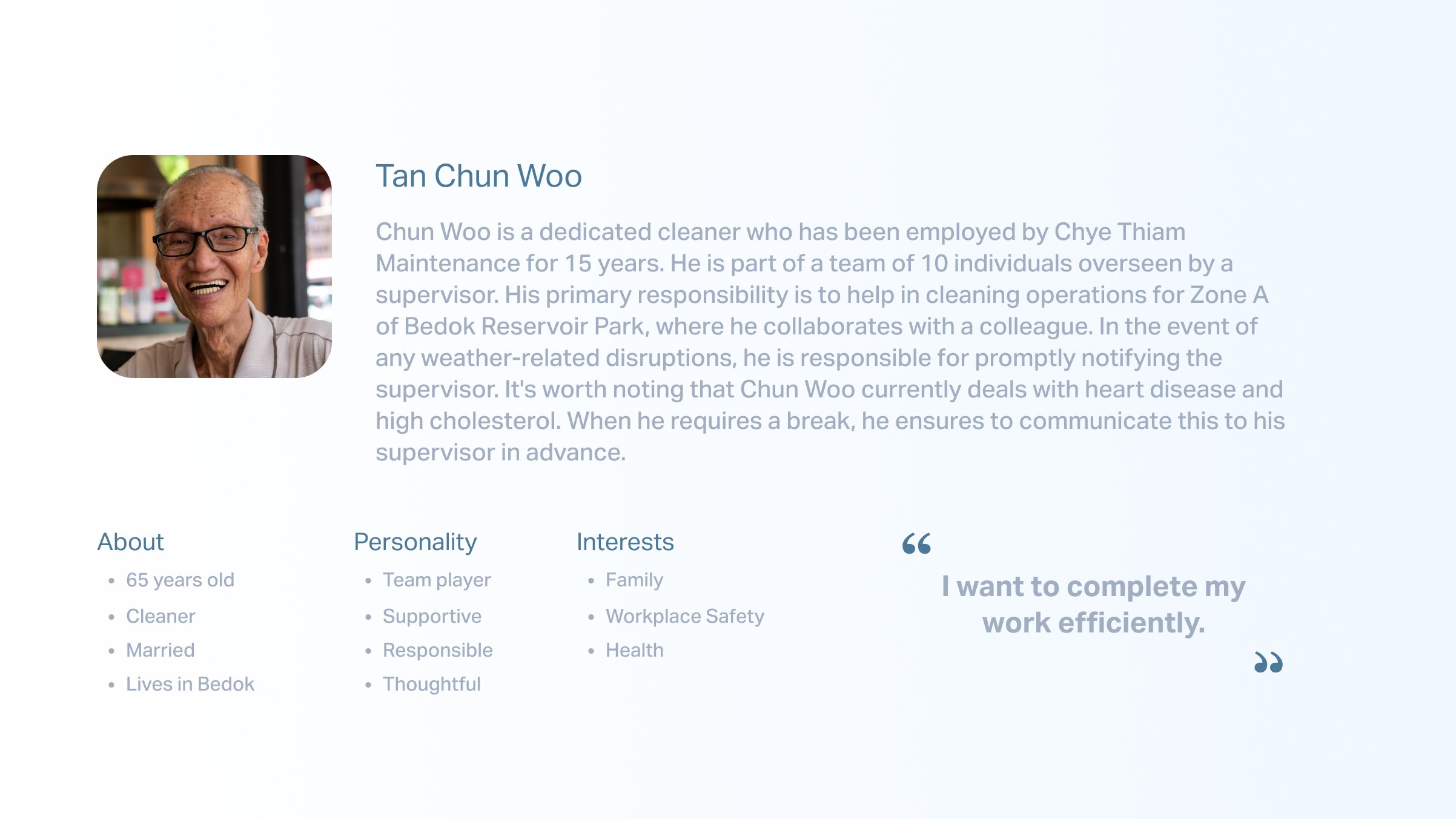
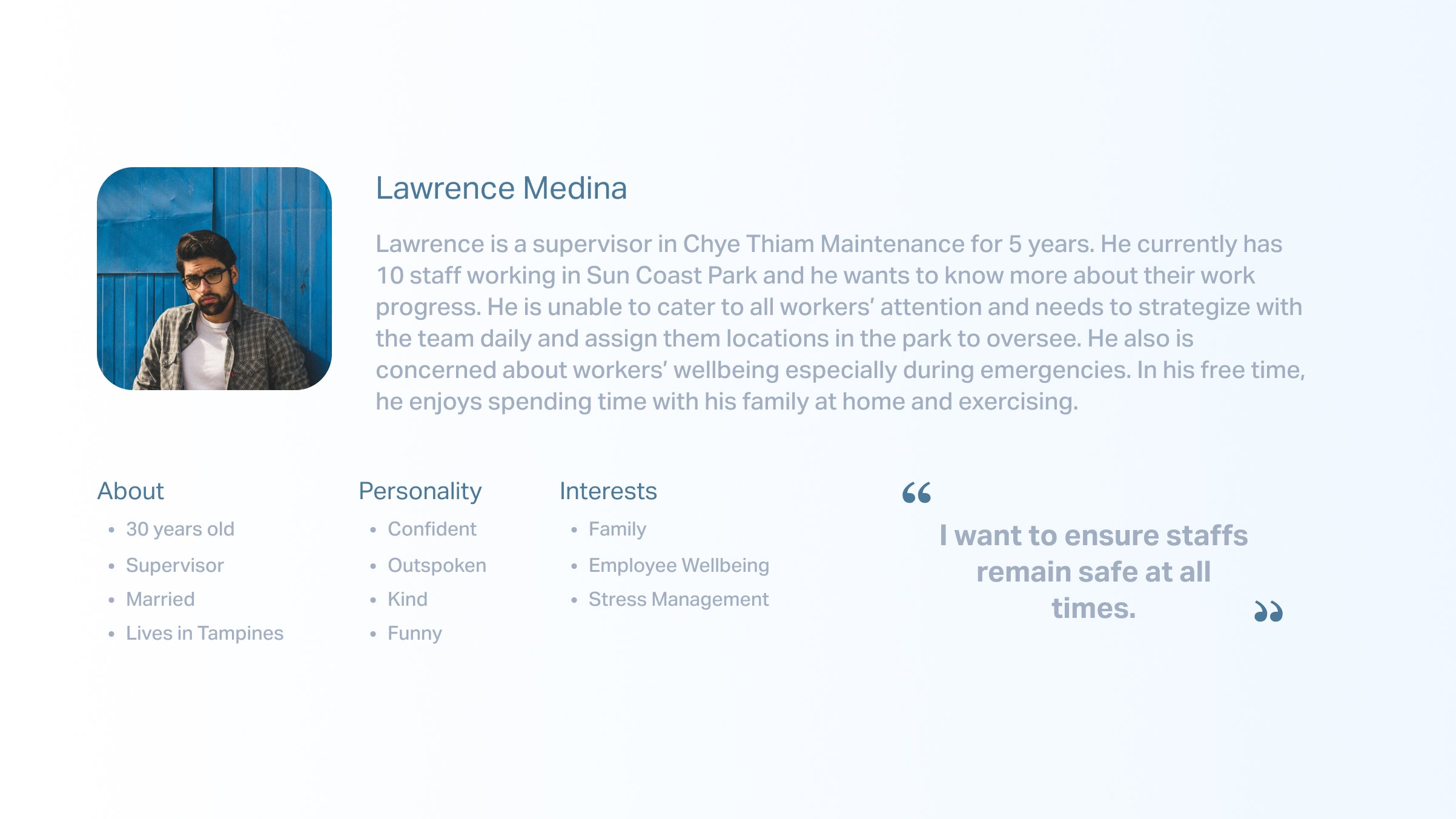
In order to better understand our users better, we headed to Bedok Reservoir which is the workers' location to conduct face to face interviews . We conducted 4 face to face user interviews with Globex’s workers in their workplace with one team lead and 3 workers.


Personas


Design Exploration
We discussed about the data that could be collected from the AI team and also discussed watch and dashboard concepts that can be introduced.


Information Architecture
It was important for us to ensure that the dashboard and watch flow are clear to all users, therefore we did the information architecture on Miro to look in-depth.

Style Guide
We decided to go with a dark mode theme for dashboard and watch because we wanted to highlight the important statistics being shown. In addition, dark mode has been found to reduce energy consumption, which is an important factor that we took into consideration especially for workers who will be working under the hot sun and have inconvenience in charging.

Dashboard key changes


Key features for launch

Emergency SOS, Fall & Crash detection
The watch will use sensors to detect falls or crashes and immediately notify supervisors of any incidents. Additionally, supervisors will have access to information regarding the severity of injuries to facilitate hospital reporting.

Tracking of irregular high & low heart rhythms
Heart rate measurements seamless integrated with the different tasks workers working daily, receiving high / low heart rate alert notifications and also alerting supervisors.
Results

Within 7 months, Vulcan AI has completed a successful pilot for this product. It is currently being used by construction workers in Chye Thiam Maintenance. This is currently also tested in other sectors such as schools, hotels and F&B. In addition, it was featured on the Deputy Prime Minister, Heng Swee Keat’s Facebook Page : https://www.facebook.com/photo.php?fbid=490873285731744&set=a.395394938612913&type=3&mibextid=h3FcK8tDbiWBGcPU
